Weather Line condenses a complex weather forecast into an easy to read graph that gives you a broad overview of the weather in seconds.
Created by Ryan Jones, Weather Line (App Store, $3.99 [CAD]) displays weather forecasts in a simple graph with a few icons and two lines. Weather Line features an hourly forecast out to 36 hours, a daily forecast that goes out 7 days, and monthly climatological normals. It can also provide short-term precipitation forecasts, but that’s only available for locations primarily within the United States & parts of the United Kingdom.
Overview
Forecast Line’s weather information is obtained from DarkSky, a global weather forecast provider that gathers forecasts from weather organizations across the world[1] and then utilizes statistics to create an ensemble forecast.[2] All this means that you get a forecast that’s usually pretty good, but can sometimes fail to catch more extreme events unless all the models are forecasting it, which is unlikely for significantly abnormal weather.

Weather Line has a fairly simple set of options. You can add additional locations alongside using geolocation[3] and set your units. The option has a temperature label, but will also alter the units of other parameters as well.
Daily View
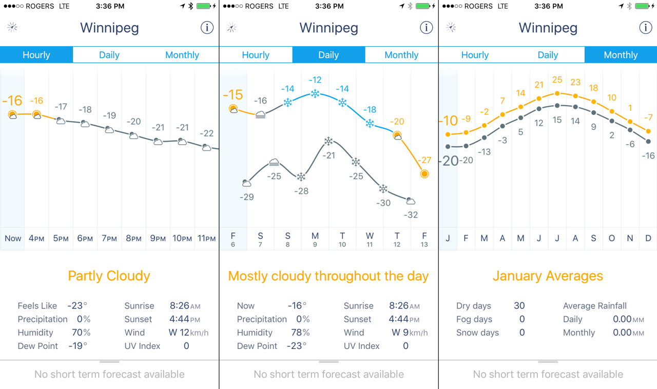
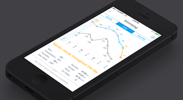
The daily view presents a graph of the next 7 days with icons depicting the day’s general weather located along one of two lines representing the high and low temperatures.
I believe this is not only the best panel in Weather Line, but also one of the best medium-range forecast presentations out there.
The icons do a good job of communicating whether it will be sunny, cloudy, rainy or snowy. The relative vertical position then conveys the relative temperature of one day to the next, with the actual expected temperature presented above the icon. Further to that, everything is then colour coded to add even more immediate visual clues: sunny is yellow, precipitation is blue, windy days are purple, and night is grey. The end result is one of the most effective ways of conveying the medium-range weather trend without overloading the message with details.
Tapping on a day will reveal additional details in the bottom panel such as the average temperature, dew point/humidity, wind, and astronomical information. Other than the average temperature, there’s no explanation of how the numbers are generated, so I’m unsure if the wind, for example, is an average wind or the highest wind or something else. The values seem to be averages, but it would be nice if that was more explicitly stated somewhere.
Other Views
You can enter an hourly view which uses a similar display to the daily view, but instead presents the forecast hour by hour for the next 48 hours utilizing a single line. Like the daily view, you can also tap on an hour to get more information in the bottom panel.
This view has all the same benefits as the daily view, but keep in mind that hourly forecasts typically have more room for error.[4]
The last view is the monthly view, which presents month-by-month climatological information for the location. This view is effective, but I’ve found the data to be lacking at times. The temperatures seem fairly accurate, but some locations–Winnipeg is one of them–are completely missing any climatological precipitation information. I’m not sure exactly why that is, but it’s likely an issue with the forecast provider and not Weather Line itself.
Other Features
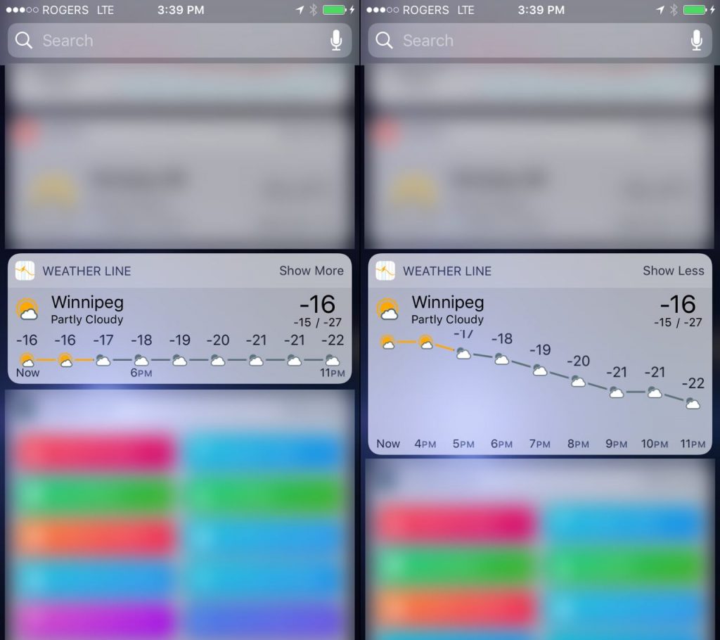
The latest version of Weather Line includes a today widget for iOS 10 that takes advantage of both collapsed and expanded views.

Both views give you a look at weather conditions & temperatures for the upcoming 8 hours. In the expanded view, the widget will display the temperatures as a graph, conveying the relative temperature changes from hour to hour. The widget works well and has a nice smooth animation transitioning from collapsed to expanded views. There are a couple bugs, one of which is evident in the screenshot above where the temperature label is displayed outside the view when there are large temperature changes, but the developer has been responsive to my communication and is working on fixes.
Other than that, there are very few other features. Weather Line does not provide push notifications for warnings or watches, and has no satellite imagery or RADAR imagery built in. You’ll need to look to other apps to access that kind of information.
Conclusion
Weather Line is an exceptionally well designed app. Its greatest strength is in the presentation of daily forecasts for the next 7 days and has become something that I keep coming back to for a quick glance of the upcoming weather. In fact, I often use it for a quick overview of what days I may need to pay more attention to when starting the forecasts I write for this site.
Weather Line’s beauty is in its simplicity and clean layout. Built on top of a fairly good forecast source, it’s a helpful app to have on your phone when you want a general overview of the upcoming week.
Weather Line – Forecast Graphs powered by Dark Sky is available on the App Store for $3.99 [CAD].
- They outline their data sources here, which include real-time weather information, weather models from the USA, Canada, and Europe. ↩
- An ensemble forecast utilizes multiple weather model outputs to produce a single forecast. ↩
- You change locations by swiping from the edges of the screen. ↩
- In many areas of forecasting, the notion of precision—adding more detail—has outpaced the desire for accuracy—actually being right. Hourly forecasts can give you an idea of what it will be like at any point during the day, but they are wrong more frequently than a daily forecast. ↩

